[type design]
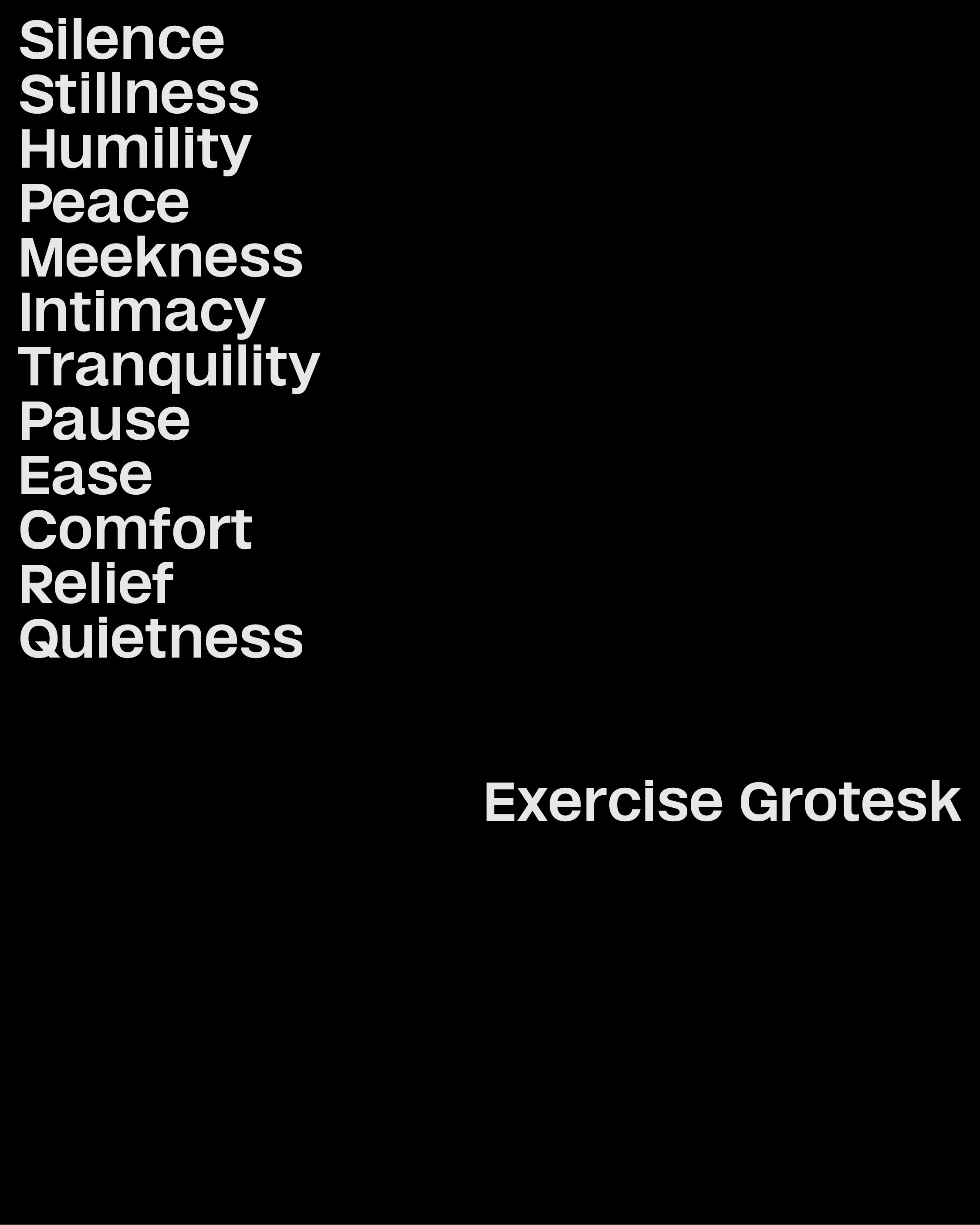
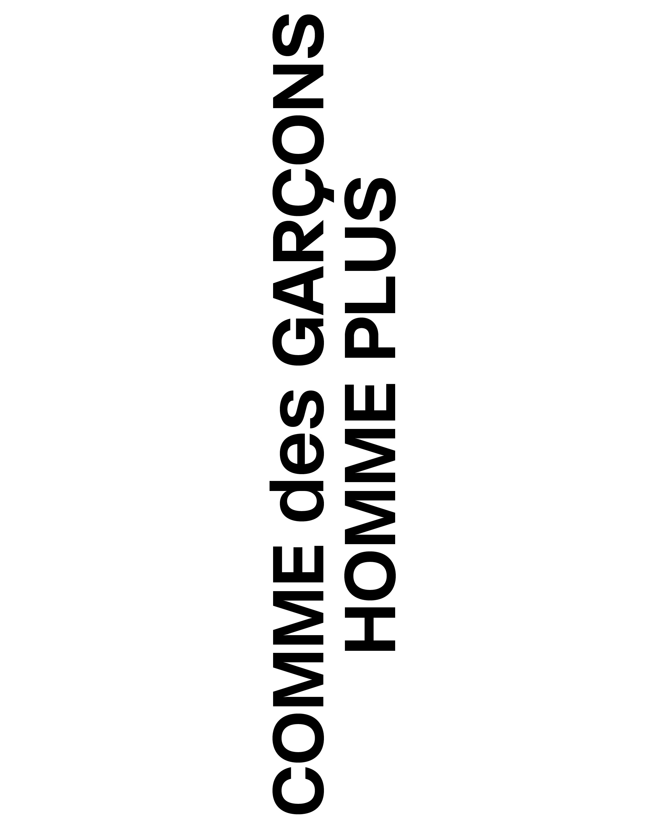
Exercise Grotesk
exercise grotesk’s shapes comes from the research of quietness. It aims to create a atmosphere comparable to ambient music, an artwork by Lee Ufan, or a black Comme des Garçons suit.
[type design]
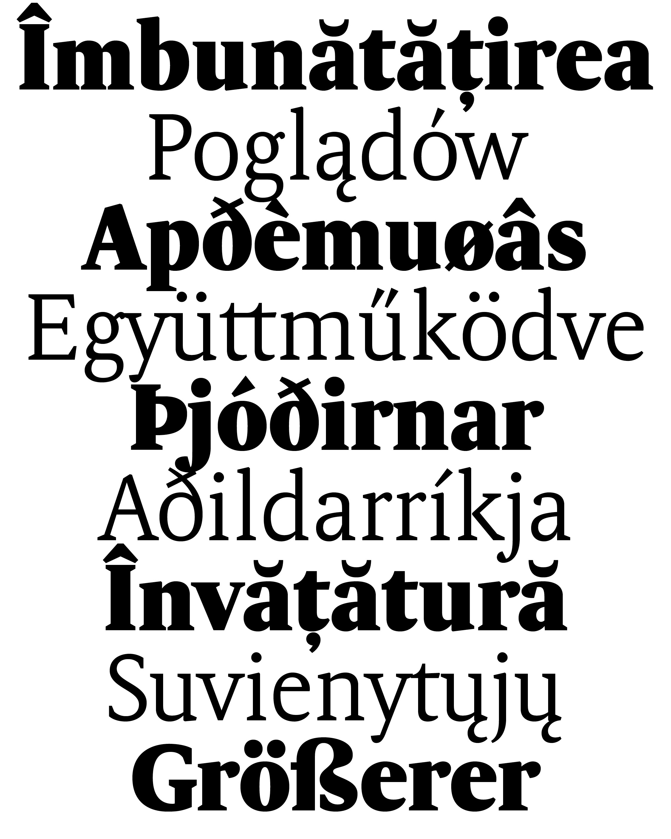
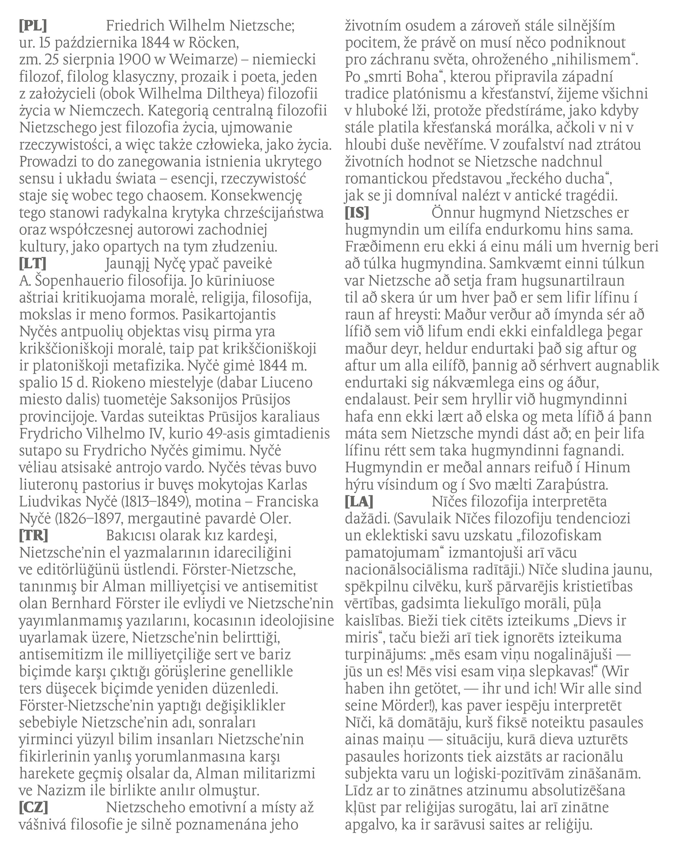
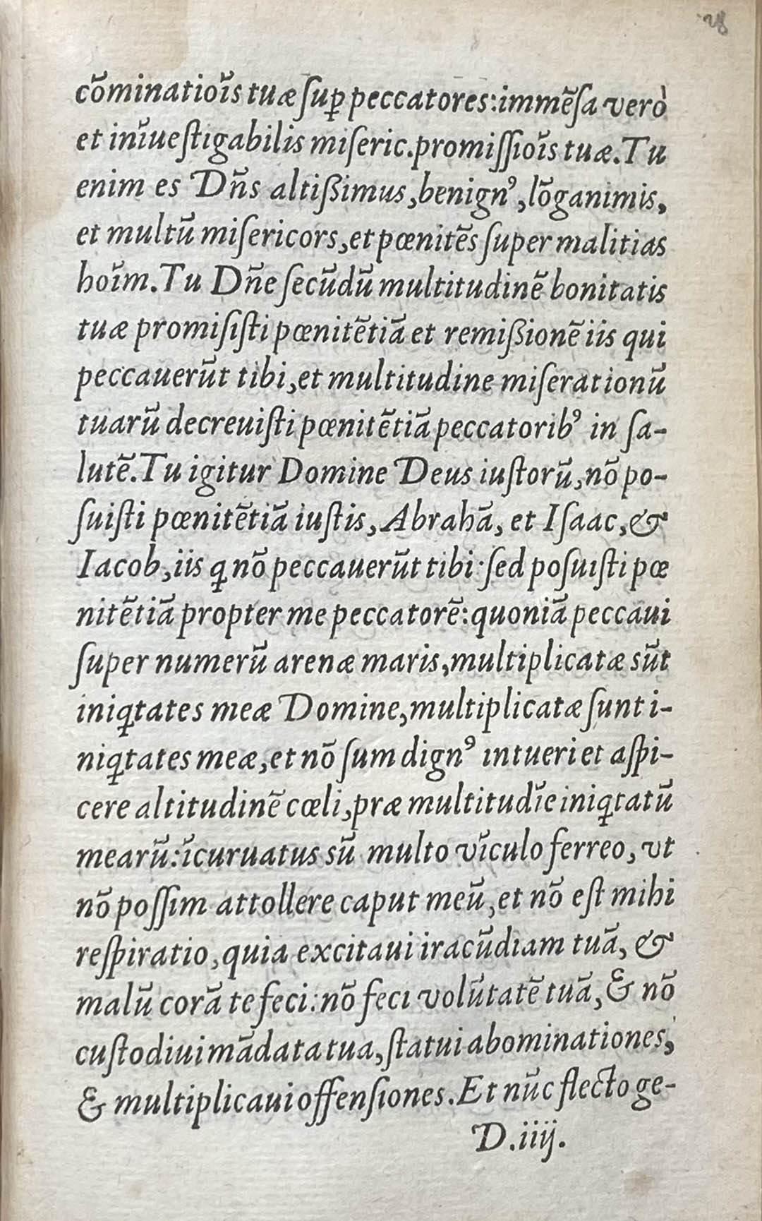
MF Böhm
Revival of the typeface found in a 1720 book from the Estienne Library.
Thought to be a bookface for today's use. Taking the shapes and the feeling of the 18th century, rooted in contemporary fashion.
In some space it is just a typeface, in some other it is more a reflection / a symbol on how beautiful life can be.
As beautiful in its coincidences as in its misunderstandings. Beautiful in the spiritual depths of what we take for granted, or commonplace. To go out to try to see beauty in what is already around us. It is the affirmation of life everywhere, from the moment we agree to see it, and to reactivate it.
This work is dedicated to anyone who feels grateful to life, for whatever reason.
[type design]
MF Böhm Mono
A study of rhythm in space, of tension in time, of expression despite repetition, of balance within constraints.


[type design]
Ransans
Ransans is the typeface interpretation of the most important person in my life. It is a gift, and the process is a piece of art I'm making for her.
Inspired by french grotesks faces from the 1970's (Antique Olive, Galfra, Colorado, Pascal…), with my contemporary approach and feeling towards it, to bring back a breathe of fresh air to this font style often forgotten.
[type design]
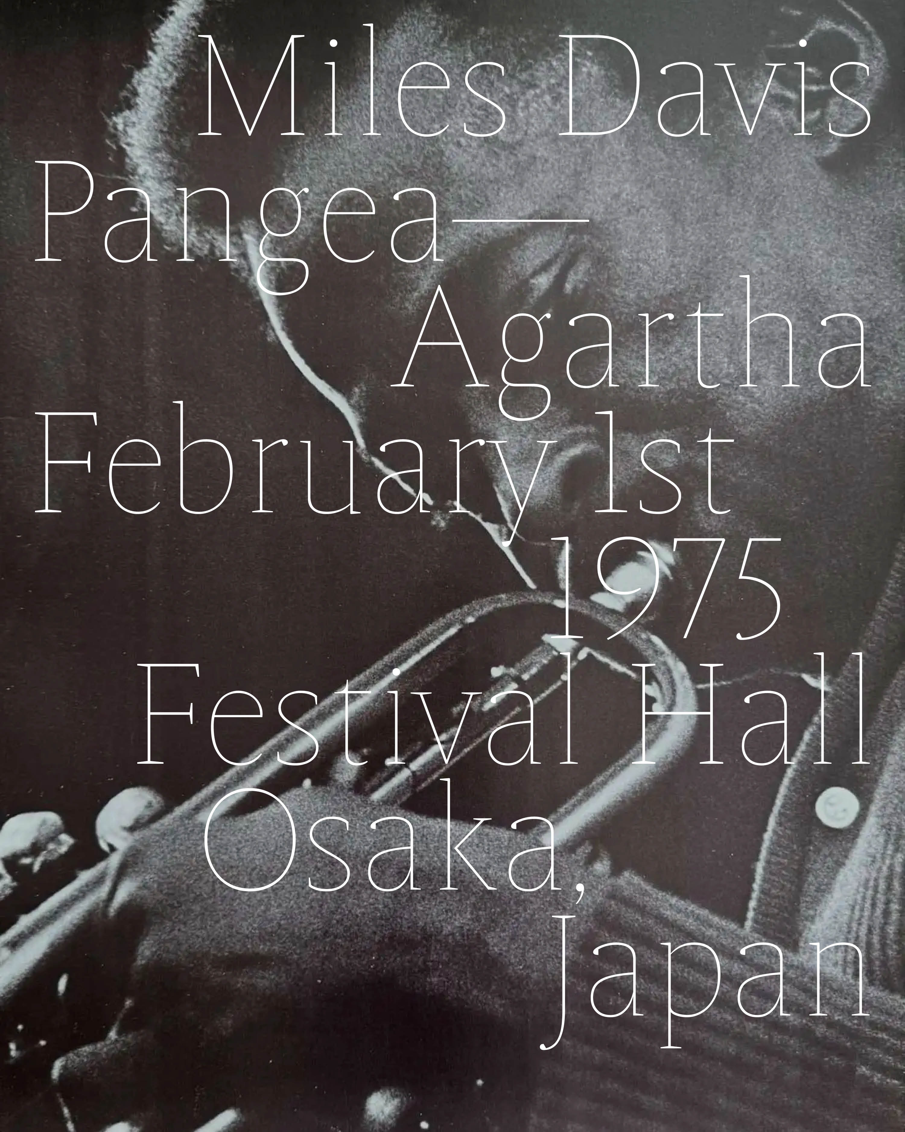
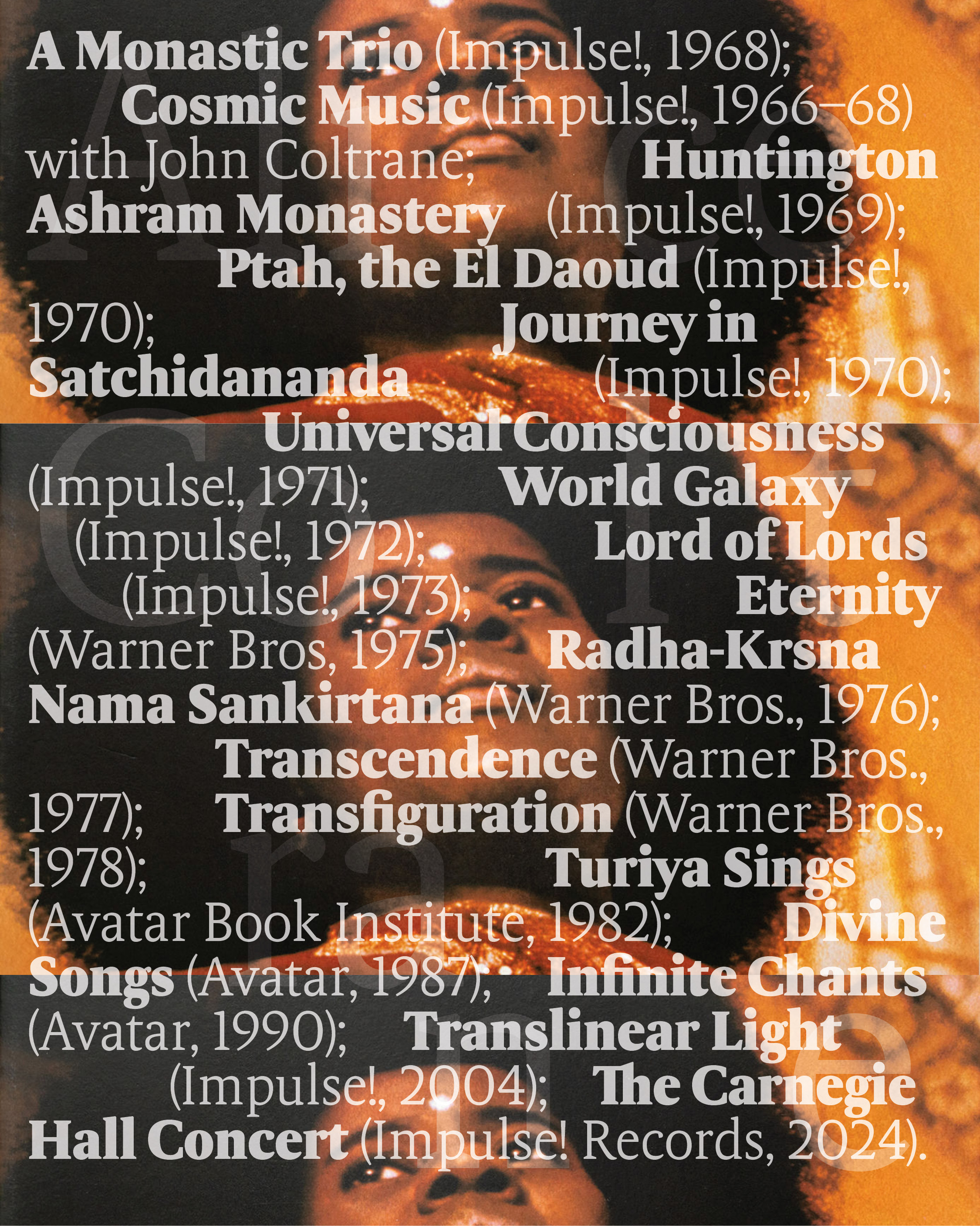
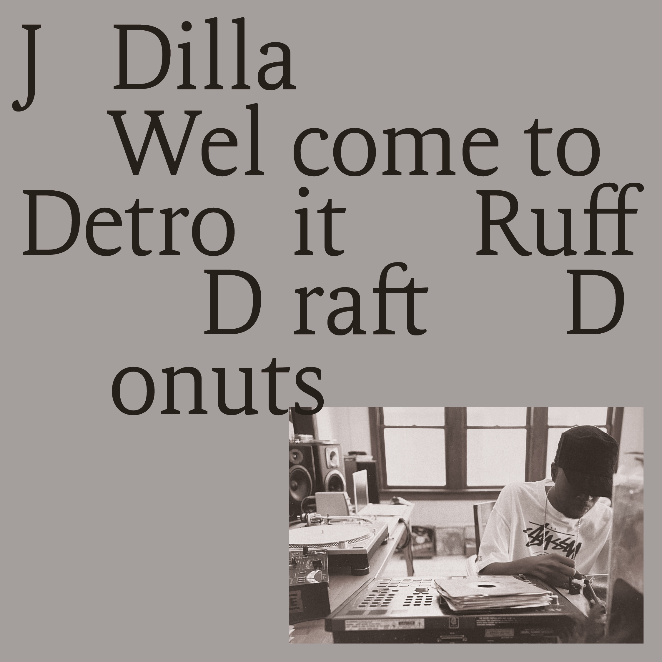
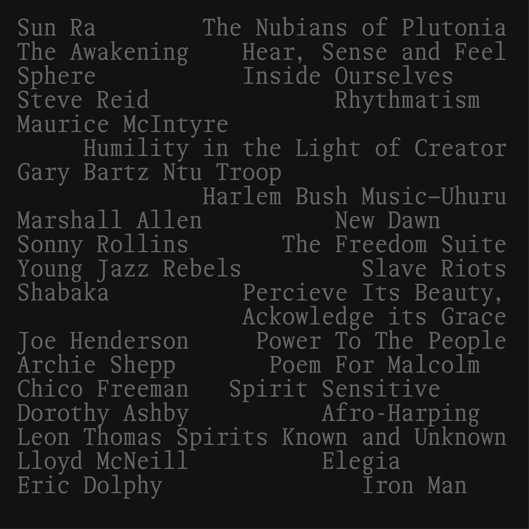
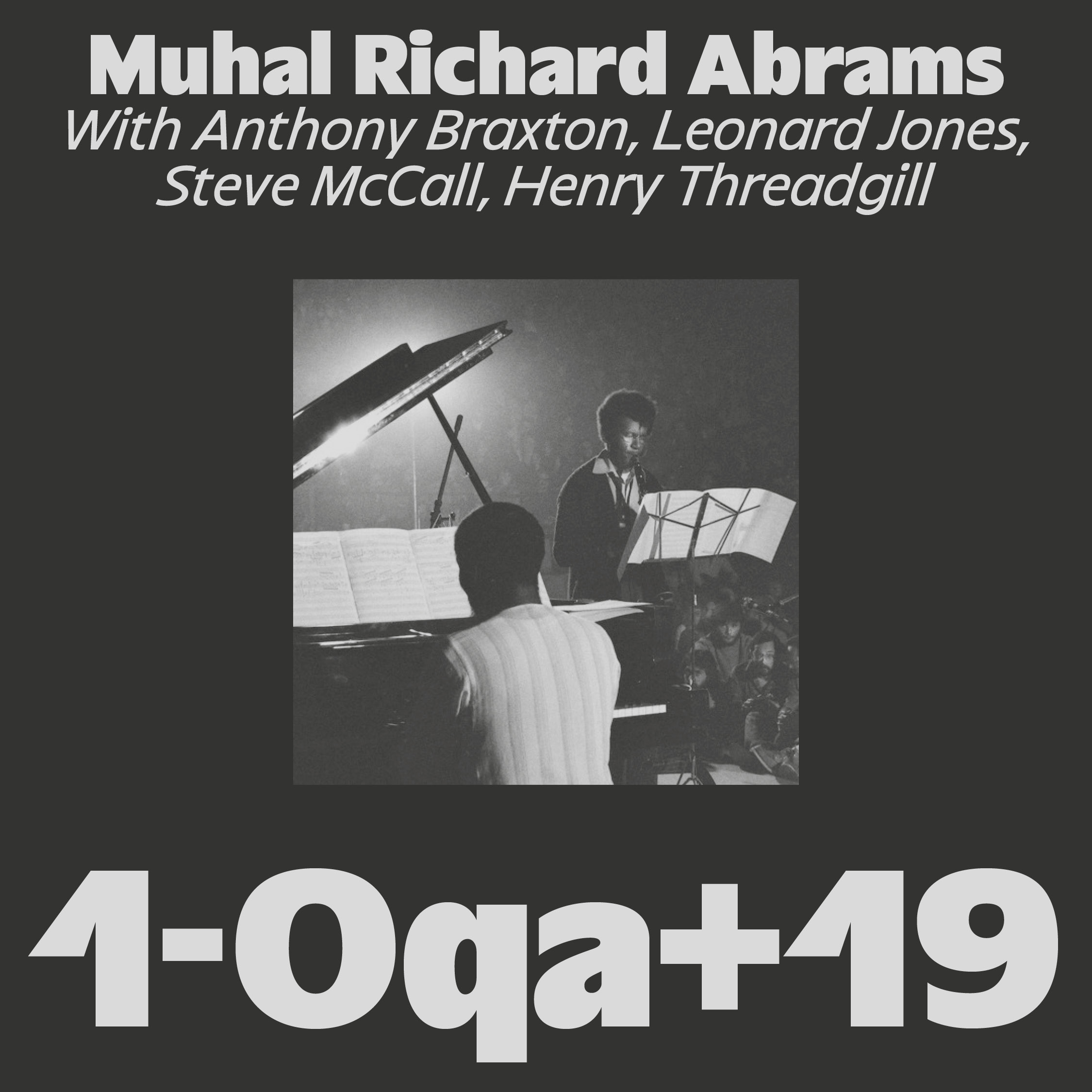
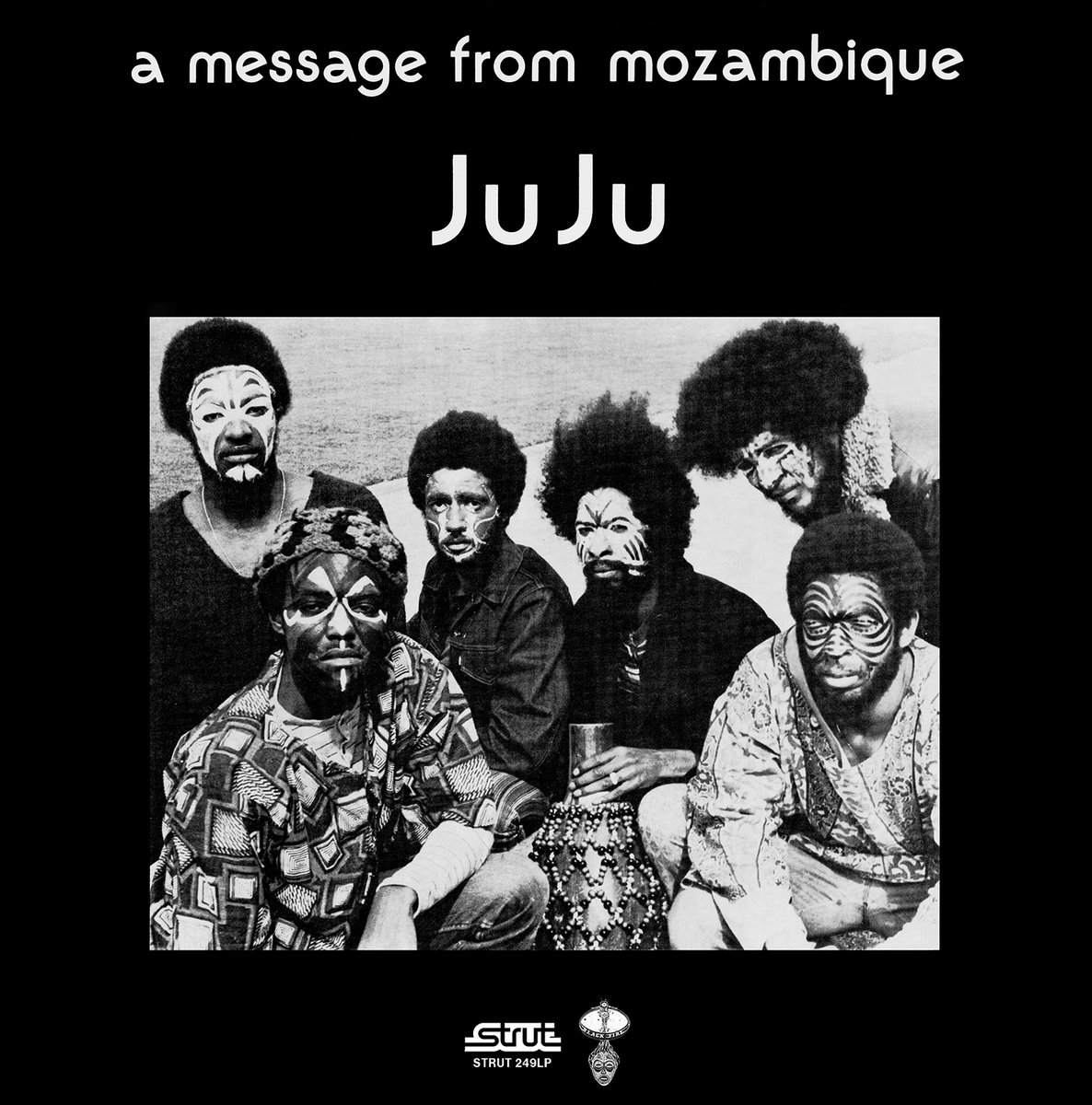
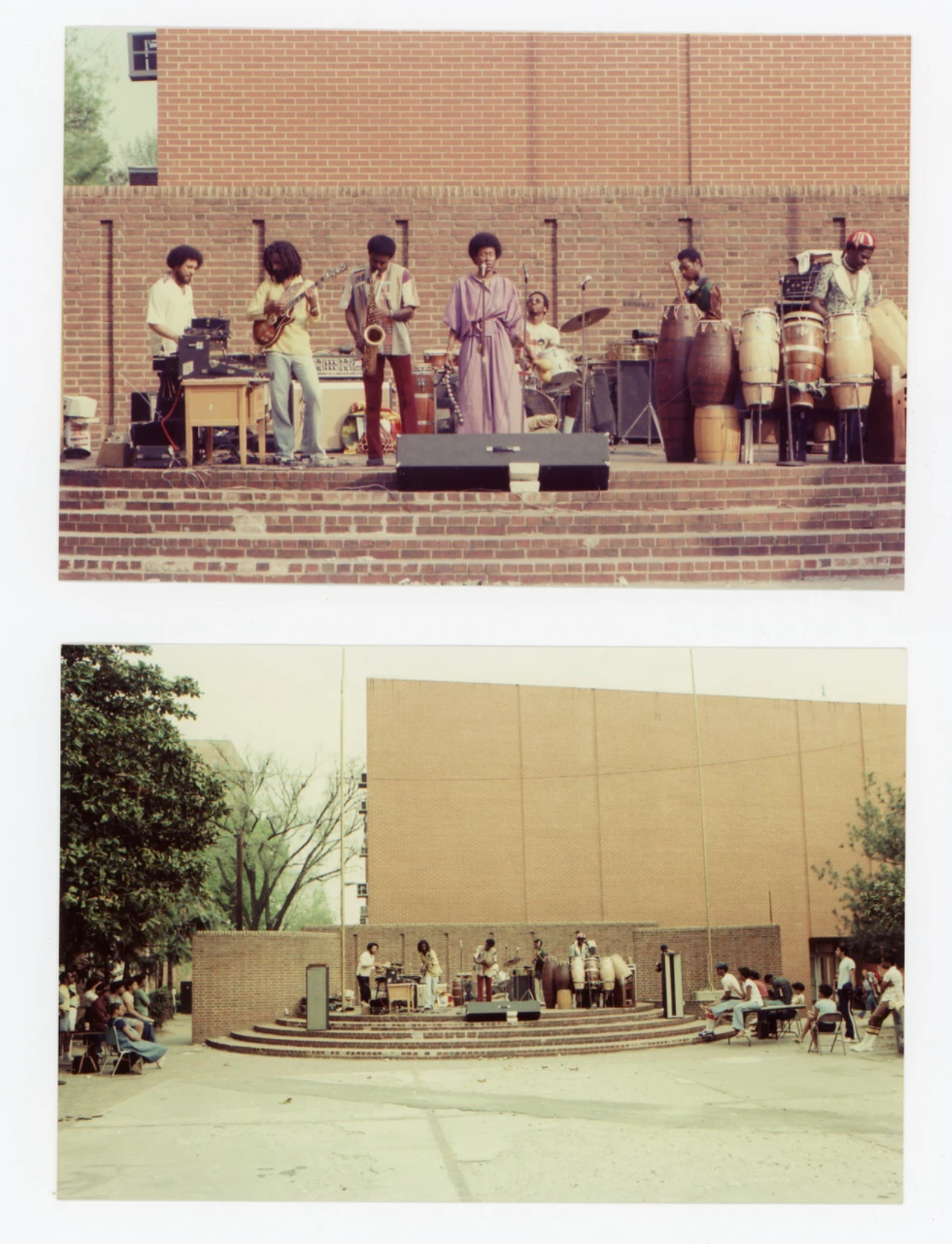
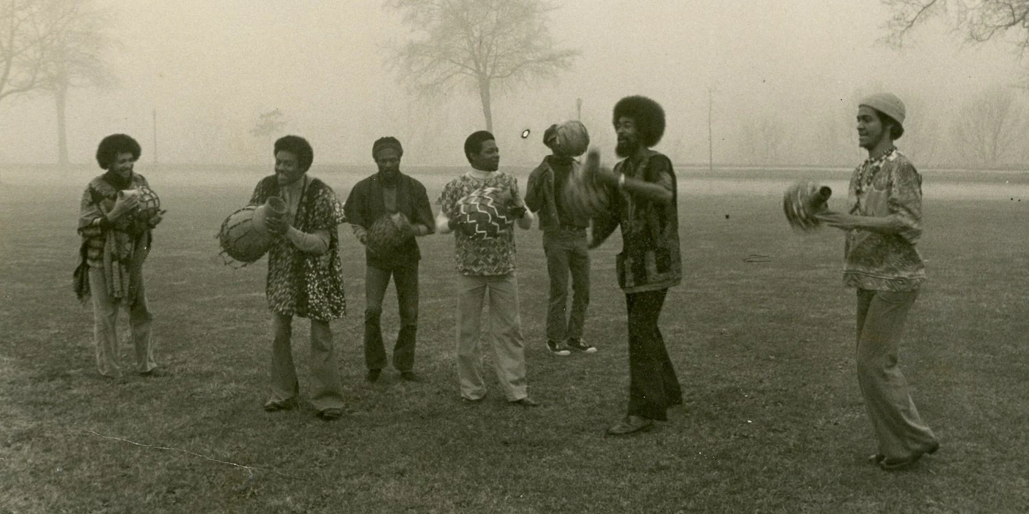
VTC JuJu [unreleased]
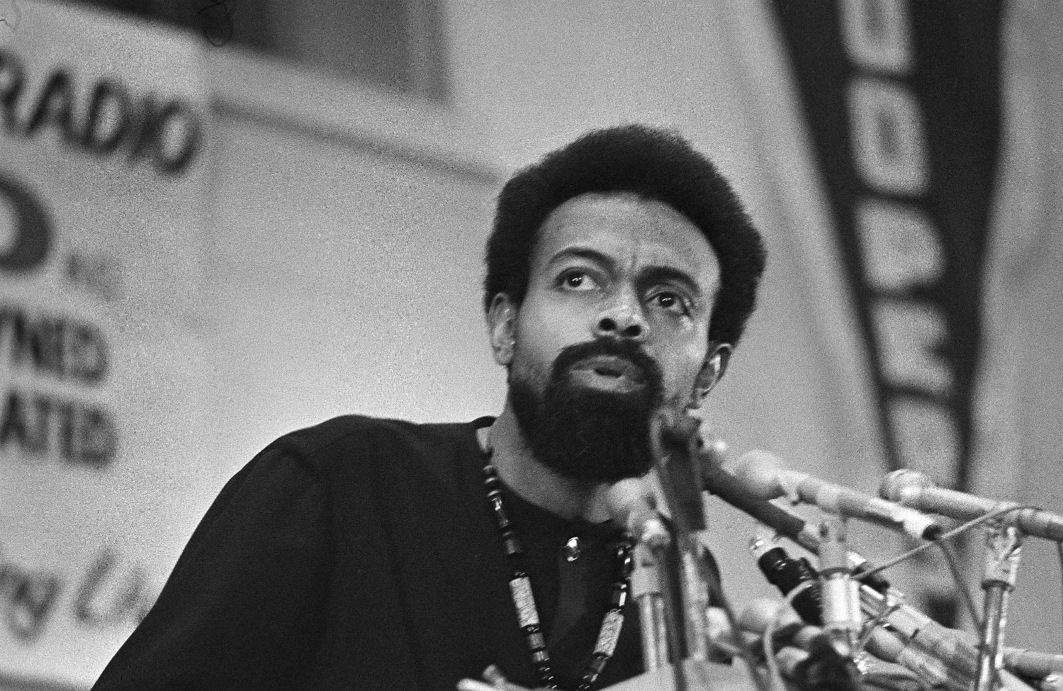
VTC JuJu is an upcoming typeface project made for and with Vocal Type. With the help of Tré Seals and Michele Patanè, I conceived this project as a tribute to an era in the history of jazz, between 1965 and 1980, during which certain musicians, groups and labels rethought the role of the jazz artist in direct relation to the Black Arts Movement, and the thinking of Amiri Baraka (LeRoi Jones).
The typeface pays tribute to the band "Oneness of Juju", their musical, philosophical and visual history.
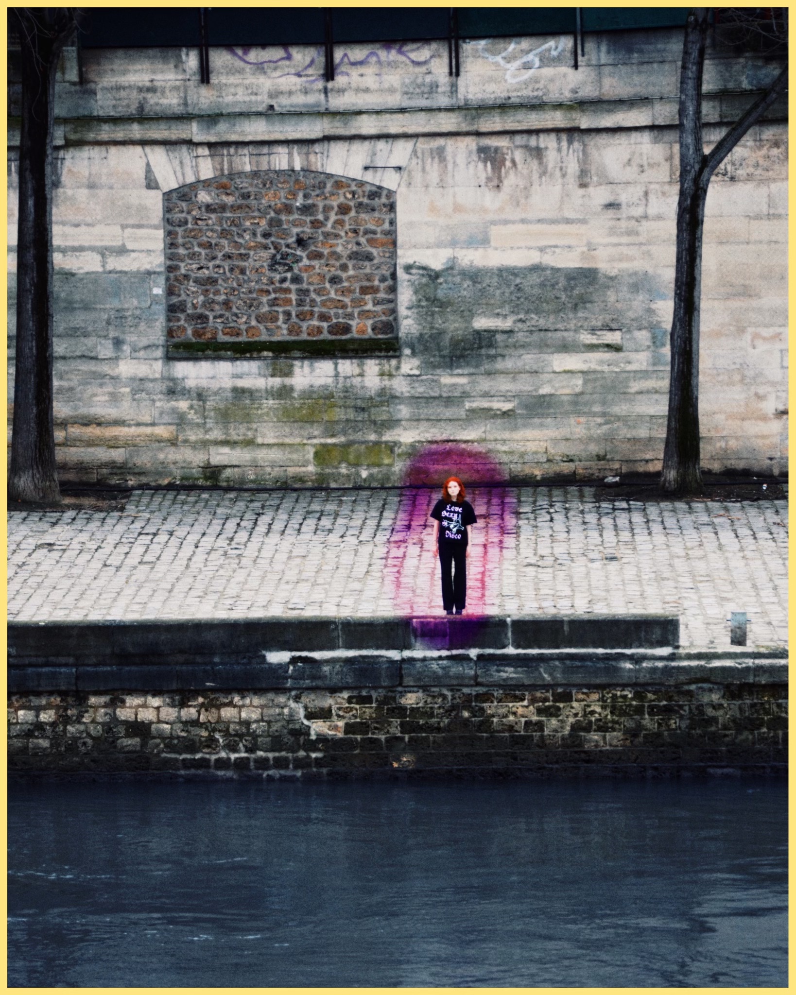
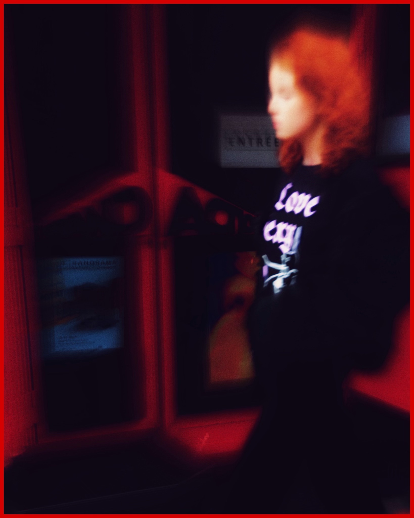
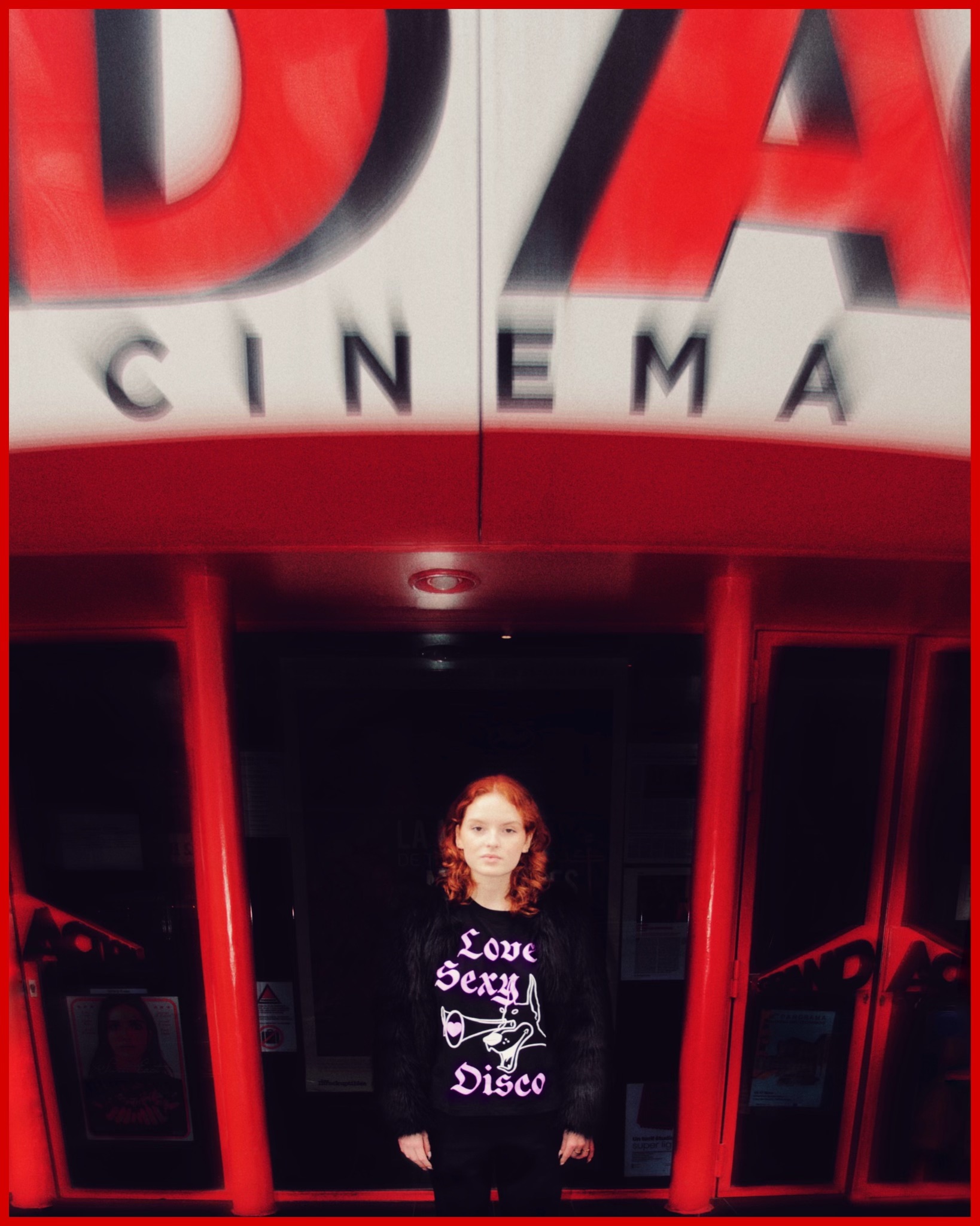
[type design / merch design]
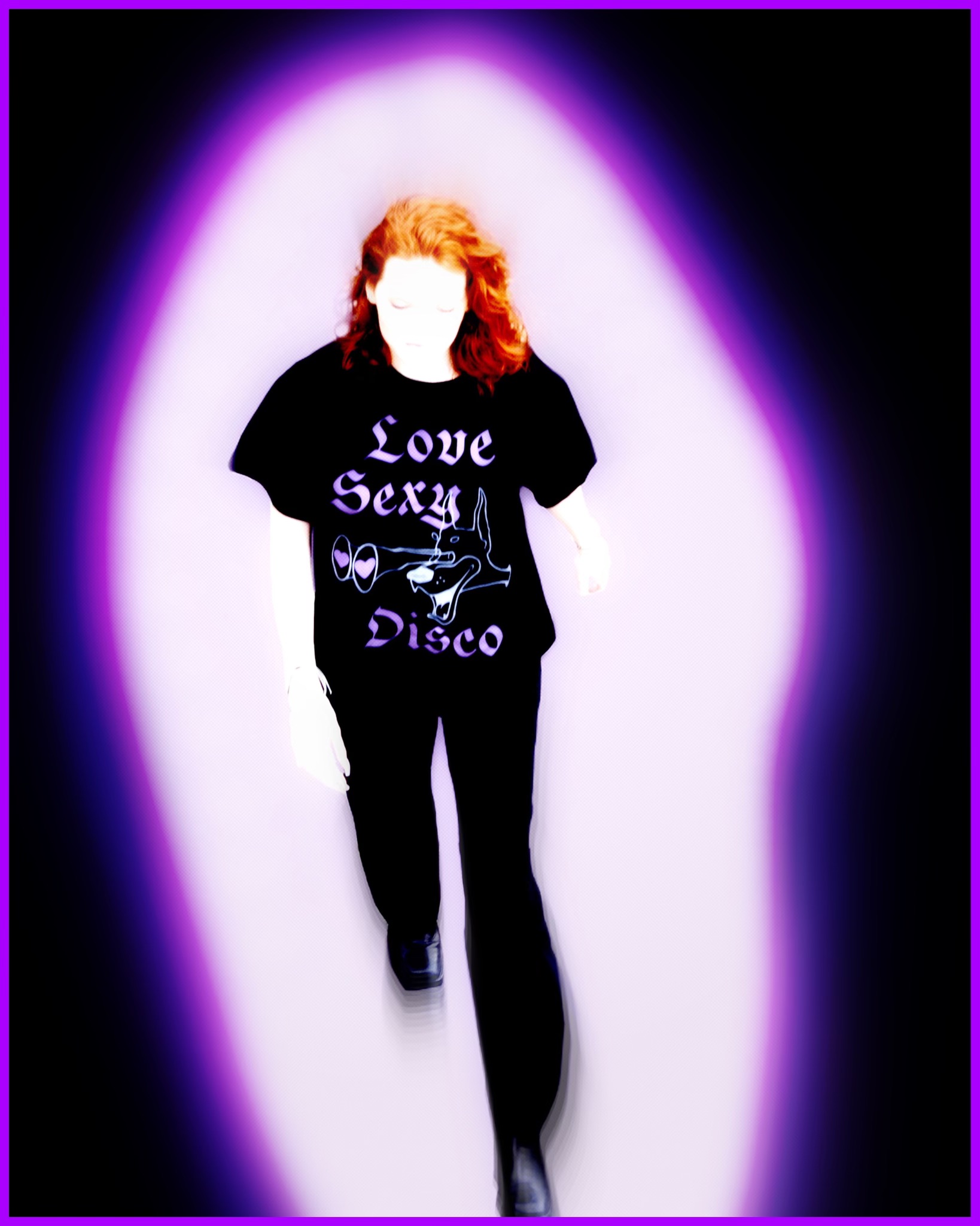
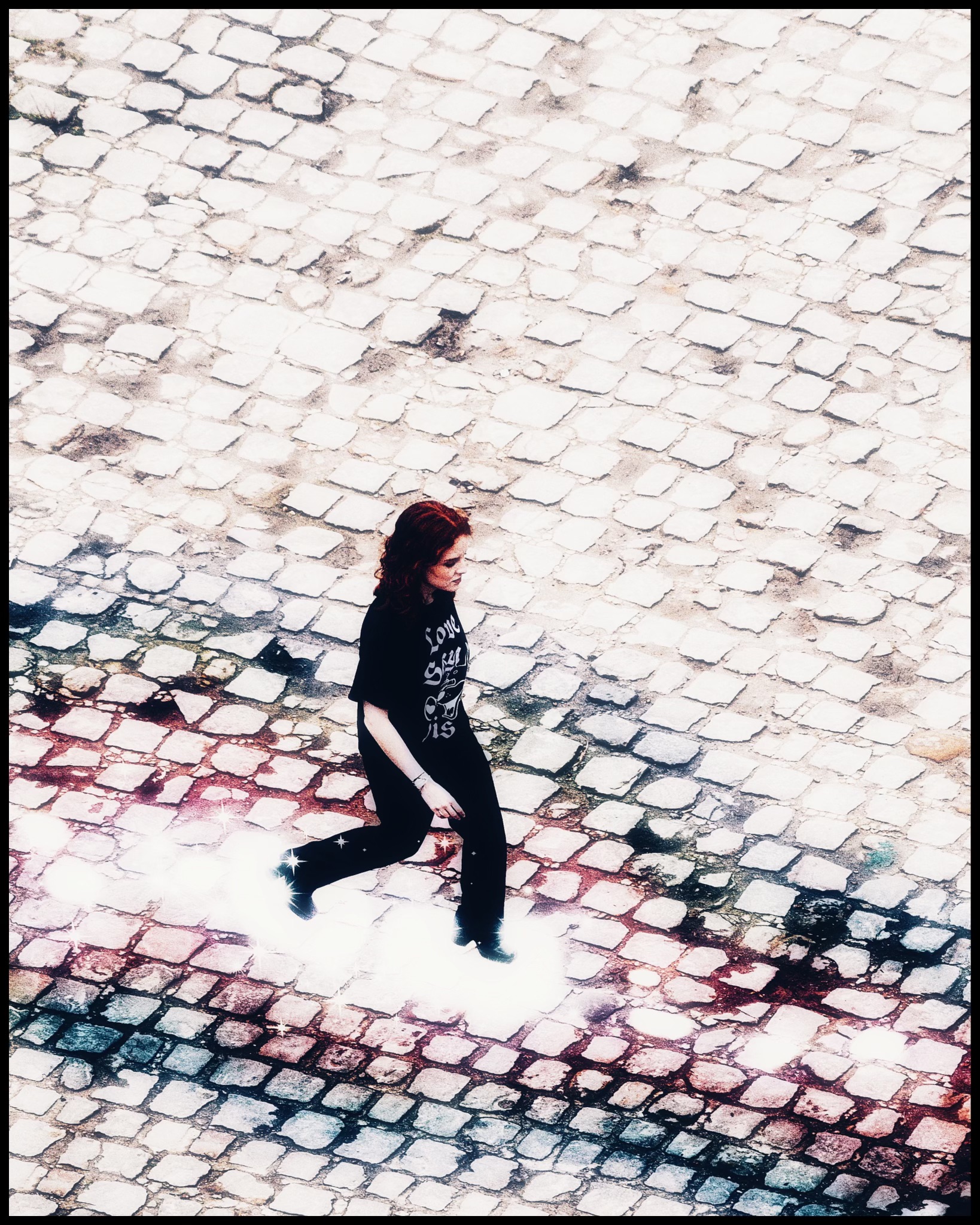
Sexy Disco
JOSÉPHA for the merch of my Sexy Disco blackletter typeface, shot by my dear Romane Huber.
This piece of work is a scream of love towards life, and towards the woman I share my life with.
Many thanks to Lauryn Roch for the marvellous lover doberman.
50 items, printed in Paris, 2024.
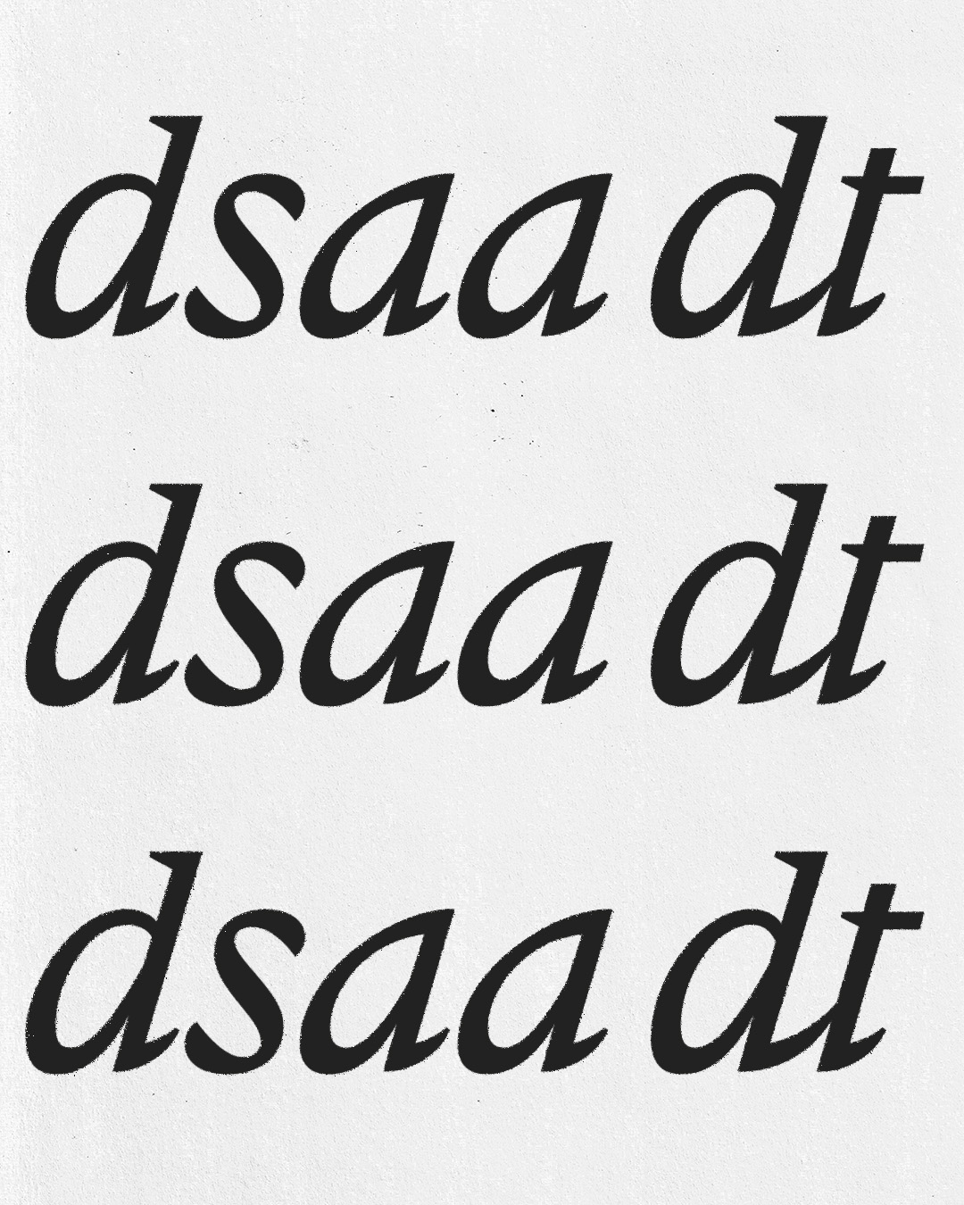
[type design / logo]
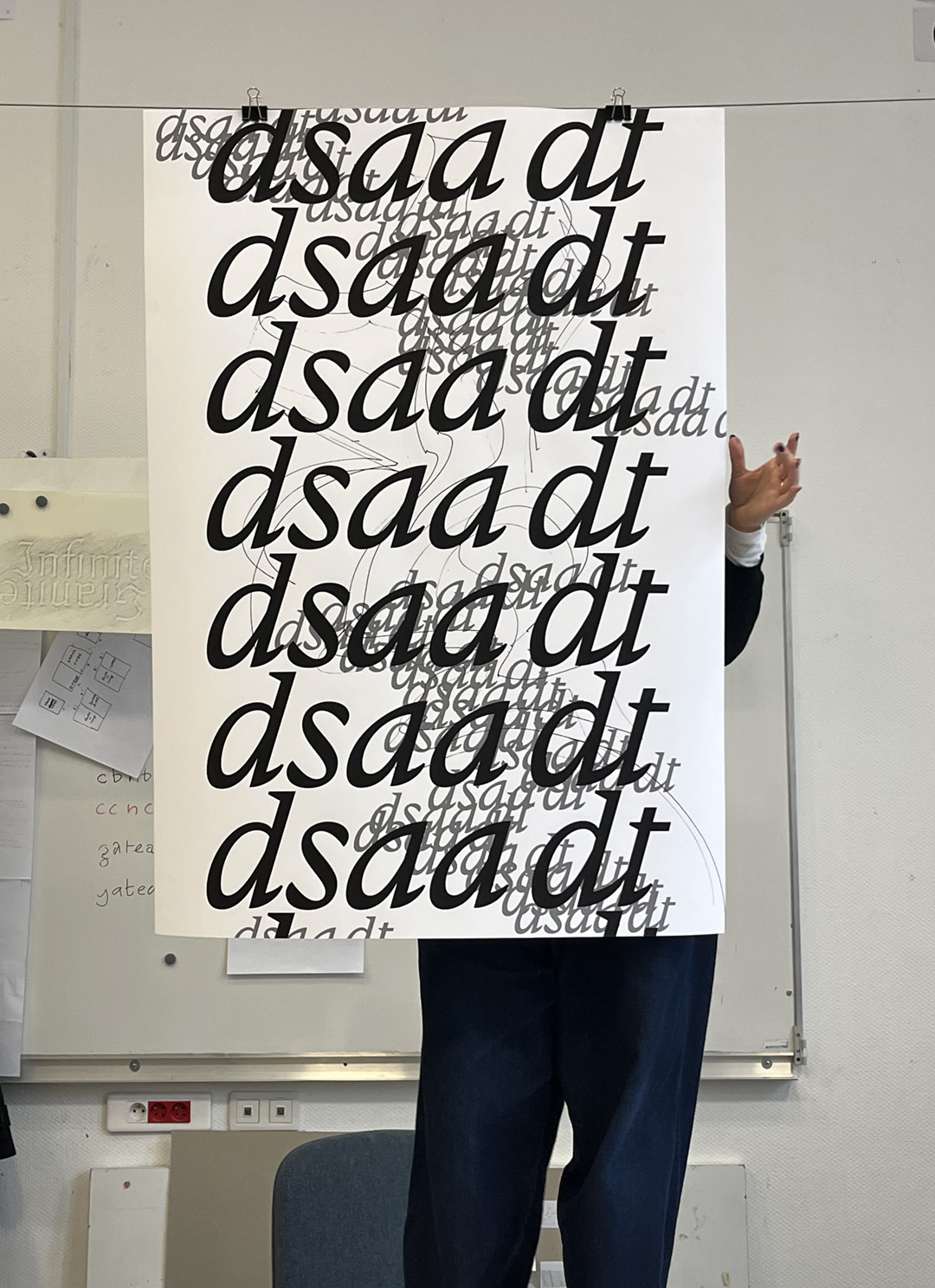
dsaa dt
A page was turned in the history of our beloved group when @e162.eu became @dsaadt.
That's why we had to rethink the logo that represented us. I coordinated the collective creation of a logo based on a typeface by Robert Estienne (the 16th century printer whose family name gave the school its name).
Our intention was to be part of a dual lineage, that of the school (through the choice of the source typeface), but also that of our predecessors (@e162.eu) through the use of italics. All of this is part of an active approach that reinvests the past in contemporary tastes, rather than passive conservative contemplation.
The shapes in the back, used here to signify the freedom and unpredictiveness of what can happen in this class, is made by @juliette.rn


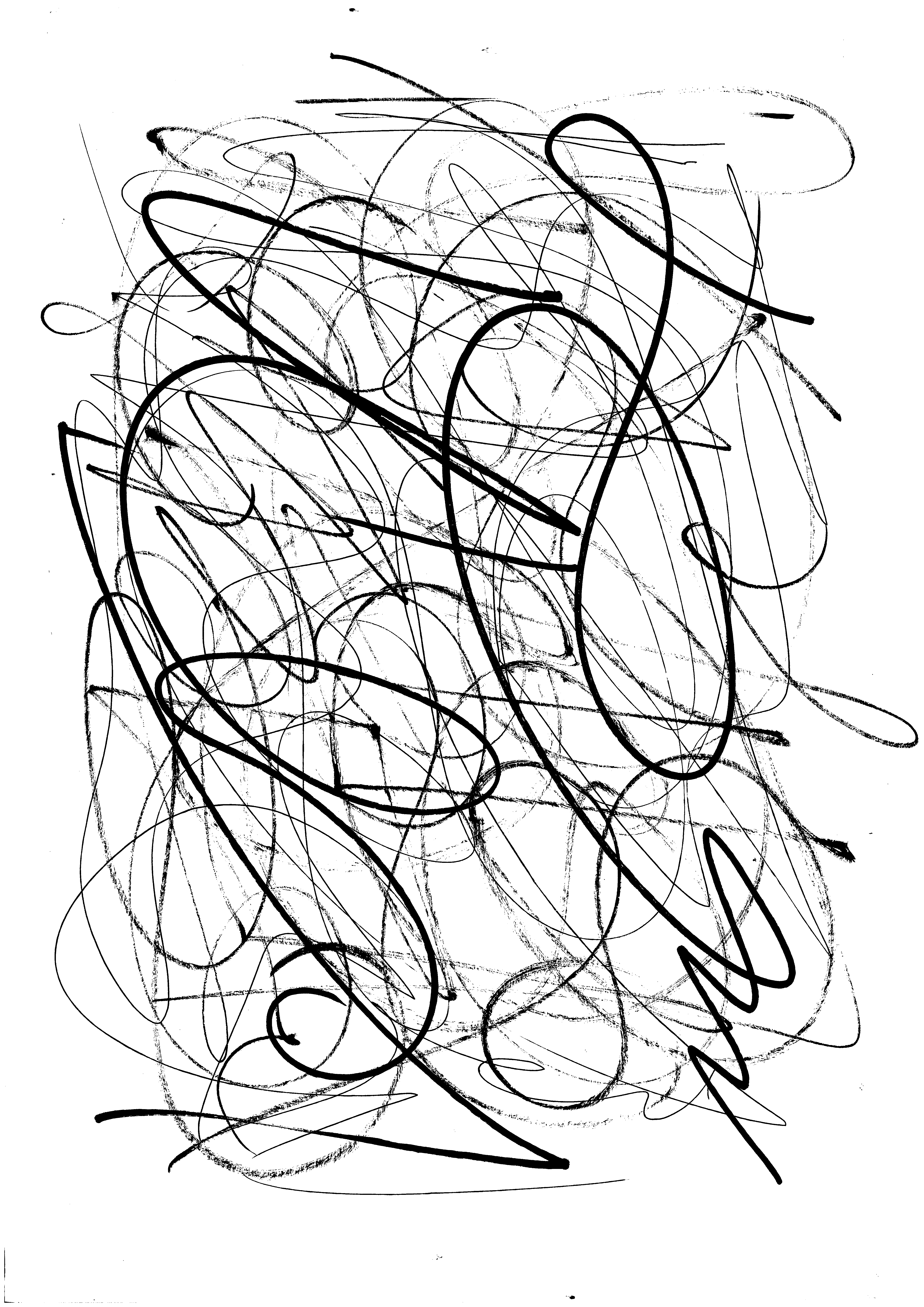
[calligraphy / improvisation]
Scriptural improvisations
In a will of knowing myself better, I mixed my jazz & calligraphy knowledge to do those "scriptural improvs".
Switching tools, & energies, a beginning, with no end already planned. I let myself be driven by how things went in the moment, seeing and being in full consciousness of where / what I was going / doing
[book design / code]
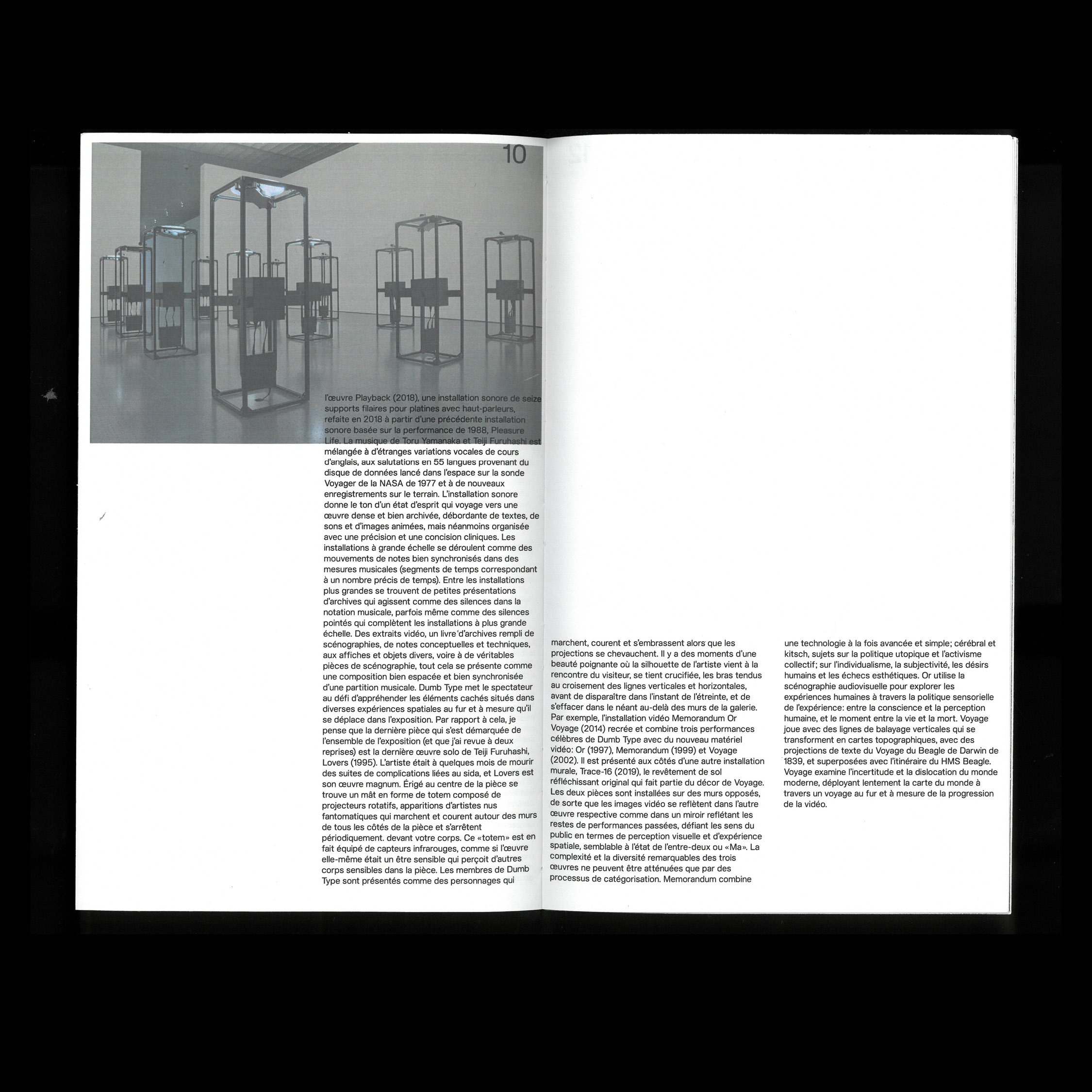
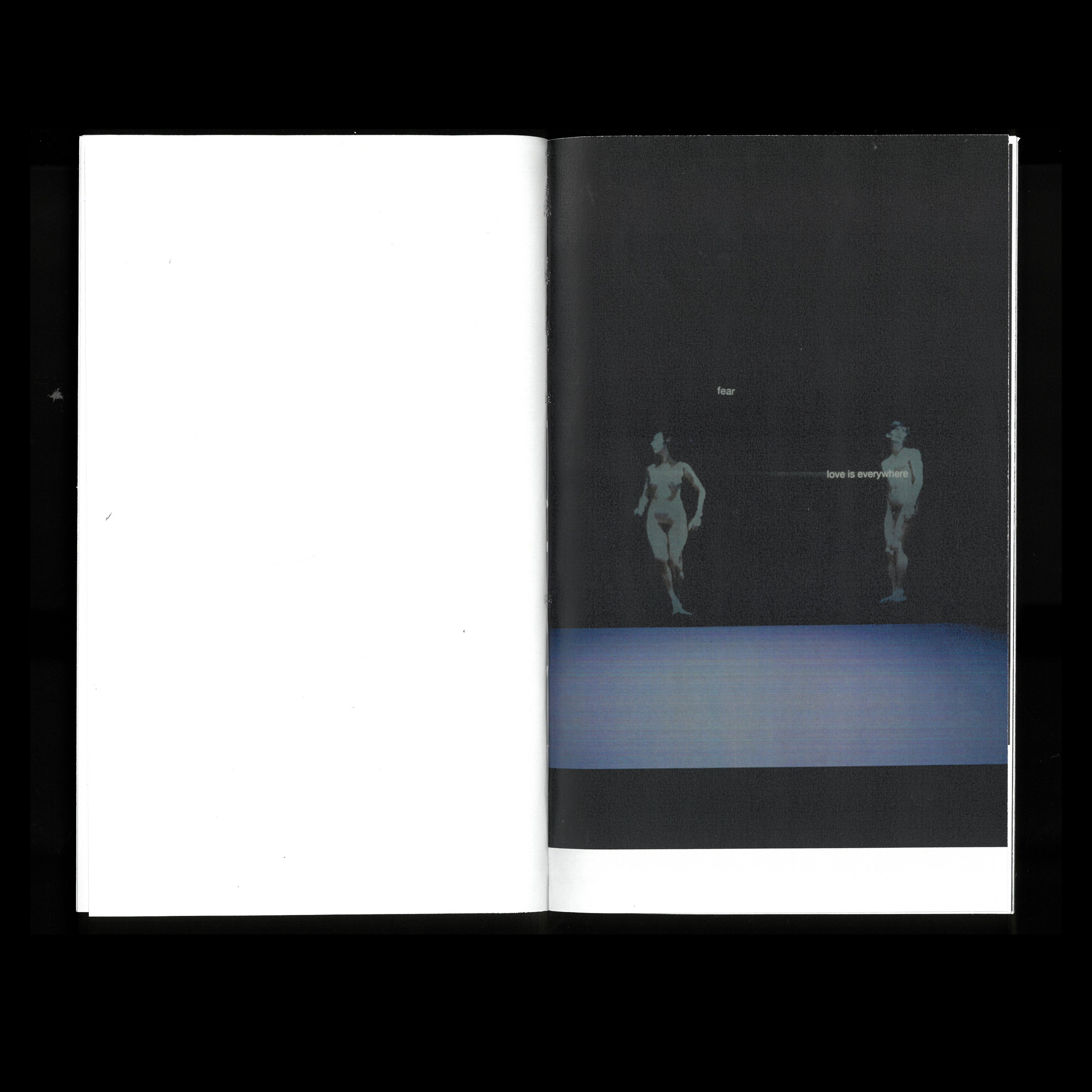
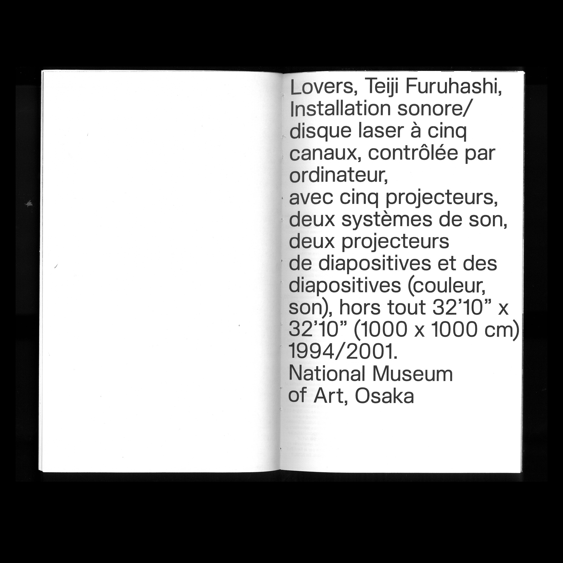
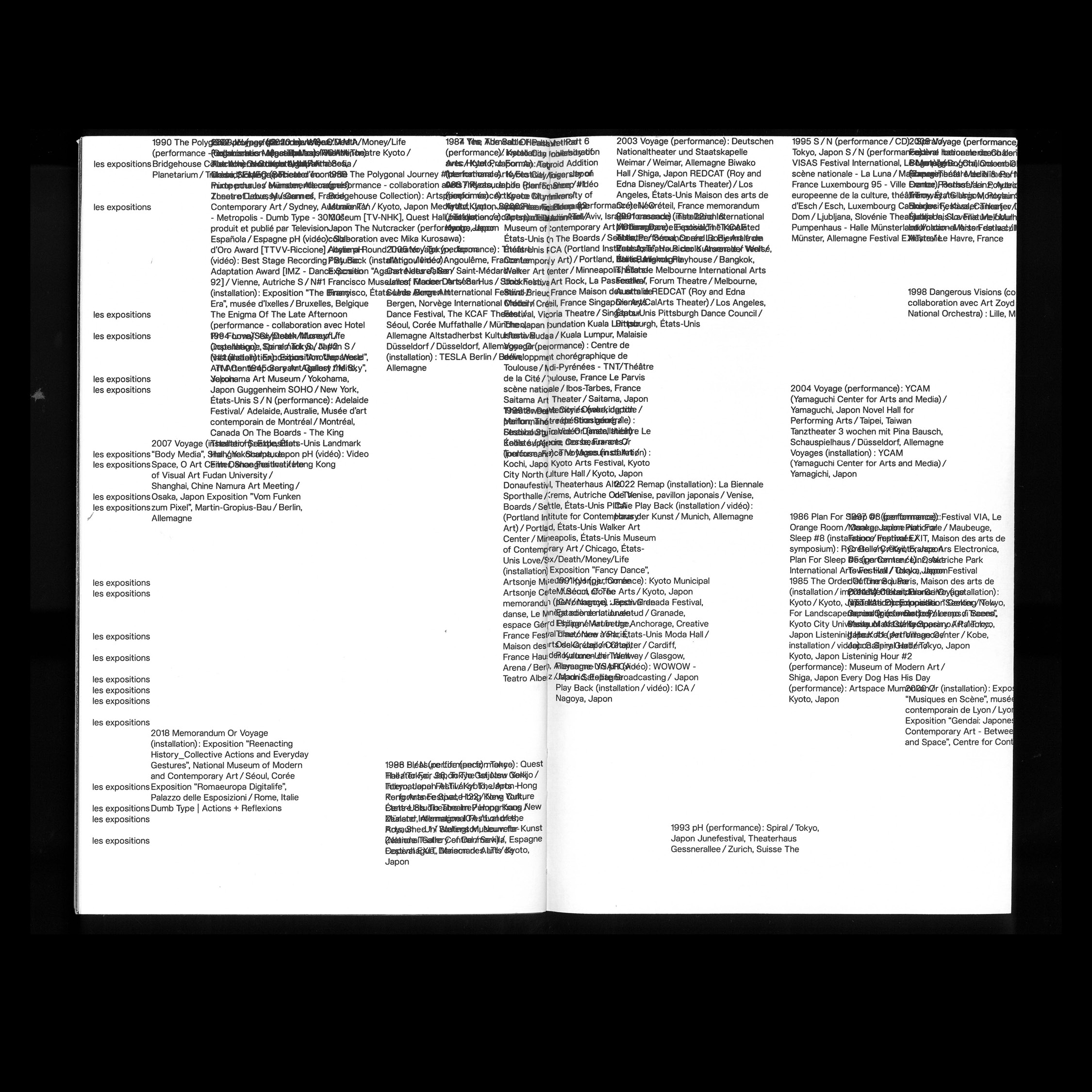
Dumb Type monograph
Dumb Type
is an artist collective based in Kyoto, Japan founded in 1984. Their work focus on the relationship between human beings and new technology.To honour their artistic approach, I wanted to test my relationship with the machine. To do so, I built this book only in Python, only using Drawbot (A big thanks to M. Réguer for his drawBotGrid and his precious personnal help on this project).
Furthermore, they insist to work with no hierarchy, and unpredictiveness, so my grid is used in a unique way for each image/text on a new page.

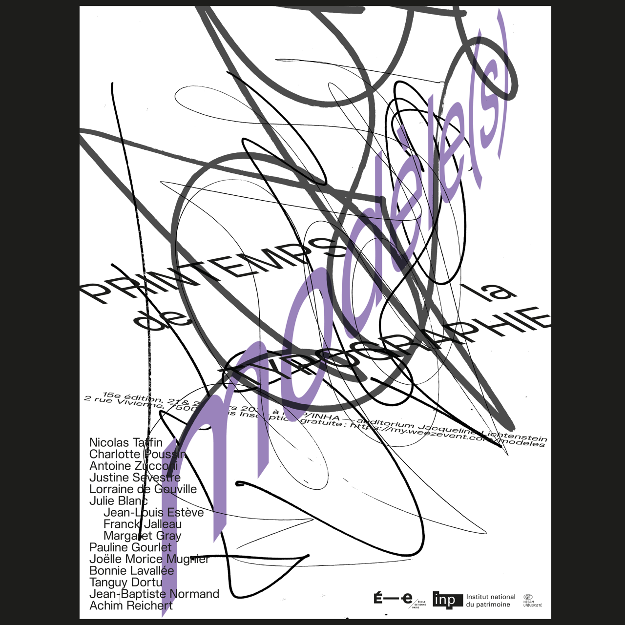
[graphic design]
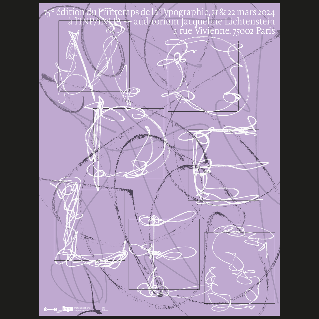
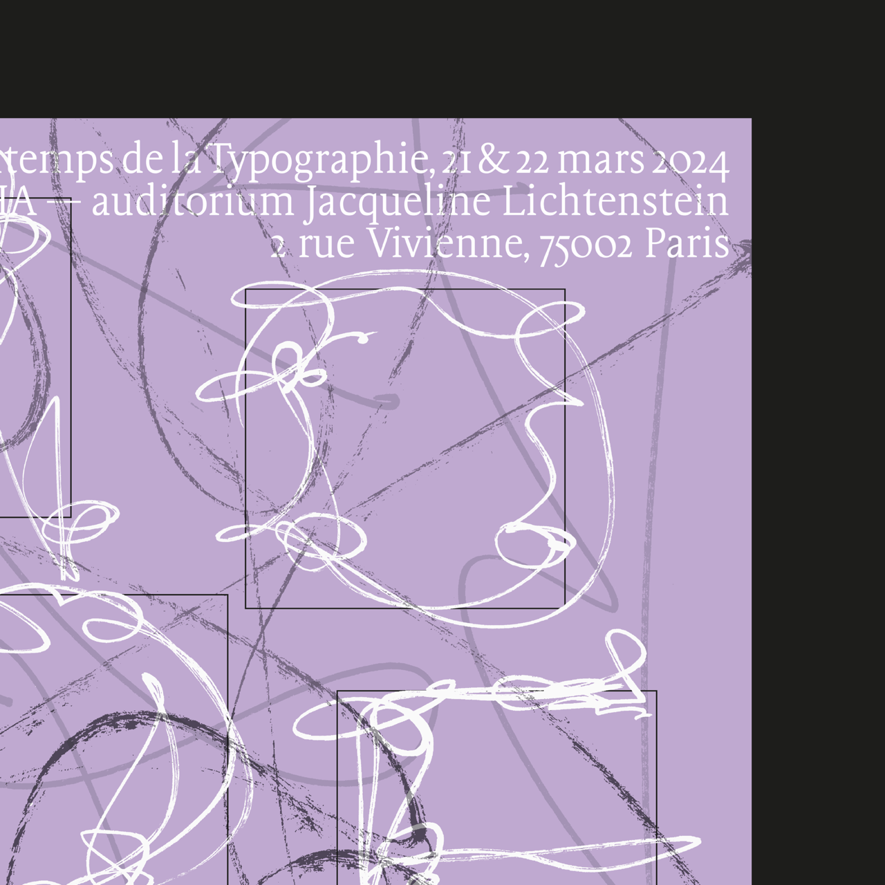
PDT poster
This years theme was "model(s)", and my take on it was to bring in some jazz. Jazz is about understanding a model (a song, a chord progression, a structure…), and to make it personnal in such a way that you are able to create your on matter on the spot: by improvising. All the stakes about how to interact with our models are in jazz. So I did some "jazzy scriptural impovisations", offering my take on how my letters models comes out when I'm improvising.
How did I digest my models, and how am I able to make them mine ?